2026
Climate Tech
Viewer
This platform brings together technologies designed to reduce greenhouse gas emissions across fast-growing industries, offering solutions at various stages of maturity. Its mission is to support sustainability professionals, strategists, investors, and innovators in navigating this complex landscape. Users can rely on the product to explore and evaluate their options for lowering emissions.
Challenge
The task was to develop an MVP concept centered around a scalable, interactive graph with a hierarchical structure and detailed pages showcasing technological solutions for optimizing business processes across various industries. Under a tight deadline, the client aimed to refine the concept for a high-stakes pitch at an investment summit.
1.
Deliver a successful product pitch at the investment forum and engage key stakeholders.
2.
Lay the groundwork for future sustainability-focused products and establish a unified visual language.
3.
Unlock additional revenue by launching new, exclusive services or recurring subscription models.

Process
At first, the client provided a wealth of research and raw data without a clear structure. We strategically dissected the information, prioritizing key features and defining the platform’s foundation. Through workshops with stakeholders, scattered insights evolved into a clear, scalable product vision. Post-MVP, extensive usability testing validated our approach, fine-tuning interactions to ensure a seamless, intuitive experience.
/ Discovery
Workshops
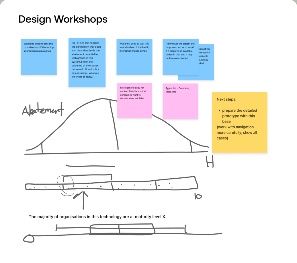
At first, the client provided a wealth of research and raw data without a clear structure. We held series of design workshops with key stakeholders, turning fragmented ideas into a clear, strategic vision. These sessions aligned goals, refined concepts, and ensured every design decision served both user needs and business objectives.
/ Hypotheses
Usability Testing
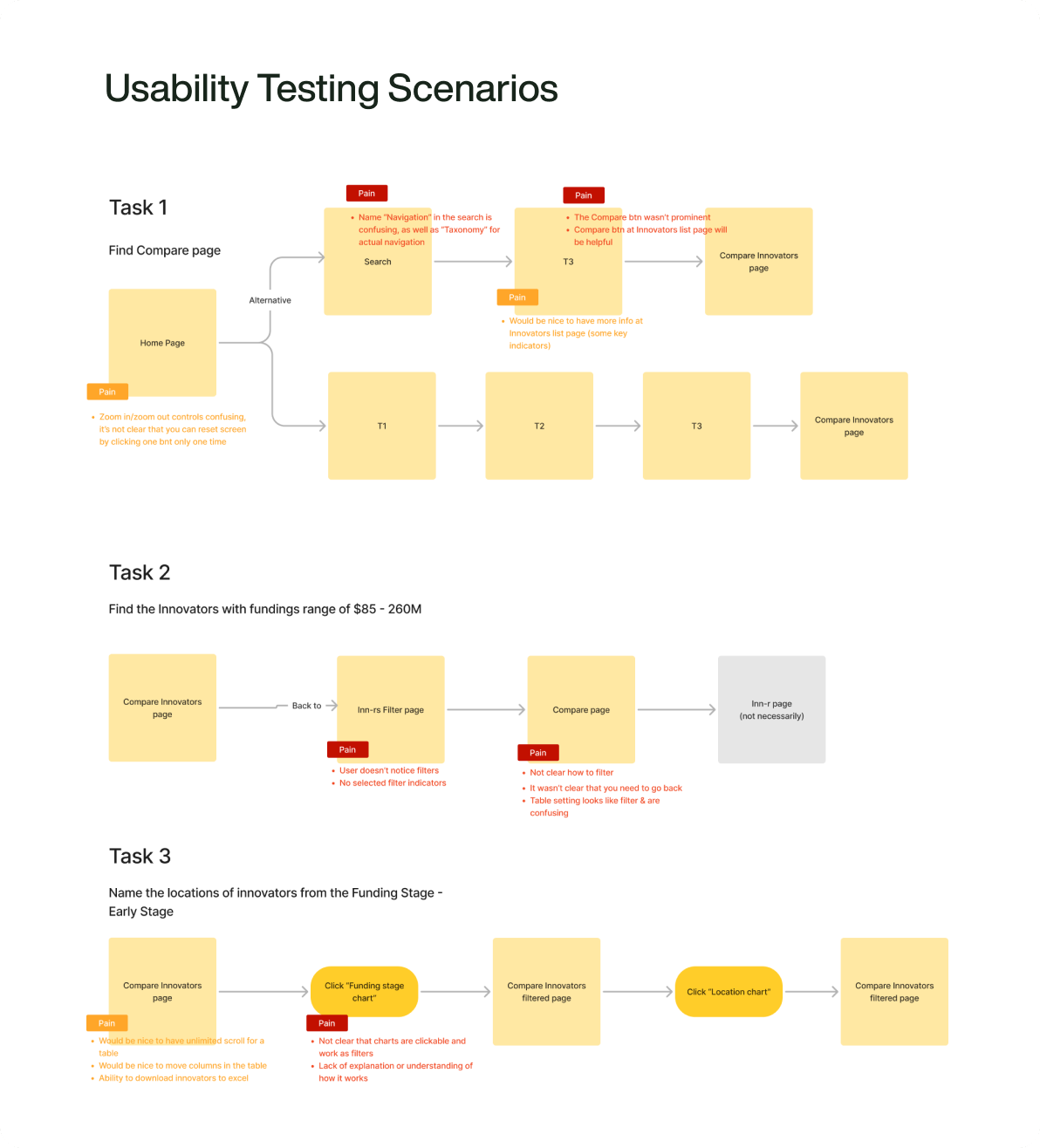
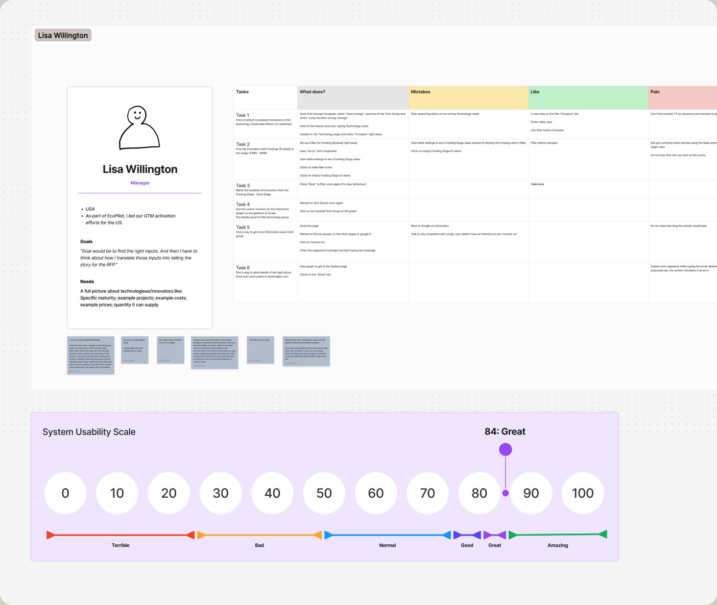
We conducted in-depth interviews and usability testing sessions to better understand the needs of different user roles and backgrounds. This helped us account for all possible system use cases and thoroughly validate multiple design solutions. Usability testing evolved into a regular, standalone service we provided throughout the entire project life cycle.
Solution
The client received a scalable product that can be easily updated with new content via the admin system. Information retrieval and presentation preparation time was significantly reduced thanks to the automation of internal workflows. The MVP was successfully showcased at an emissions reduction exhibition. My team handled four releases and continued to provide consultative support for the development of related tools.
/ Feature 1
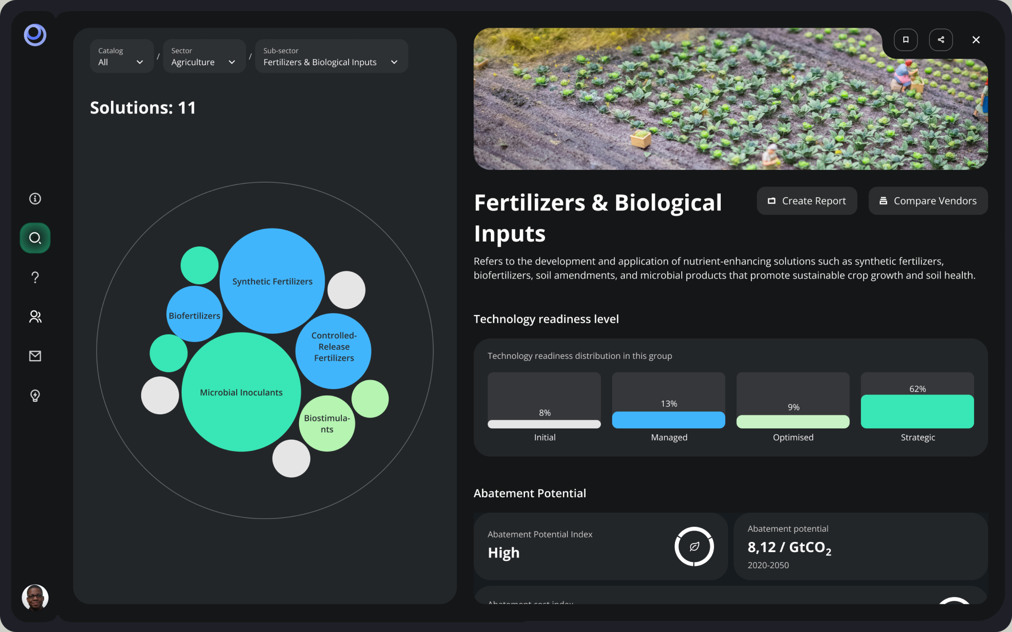
Technology Details
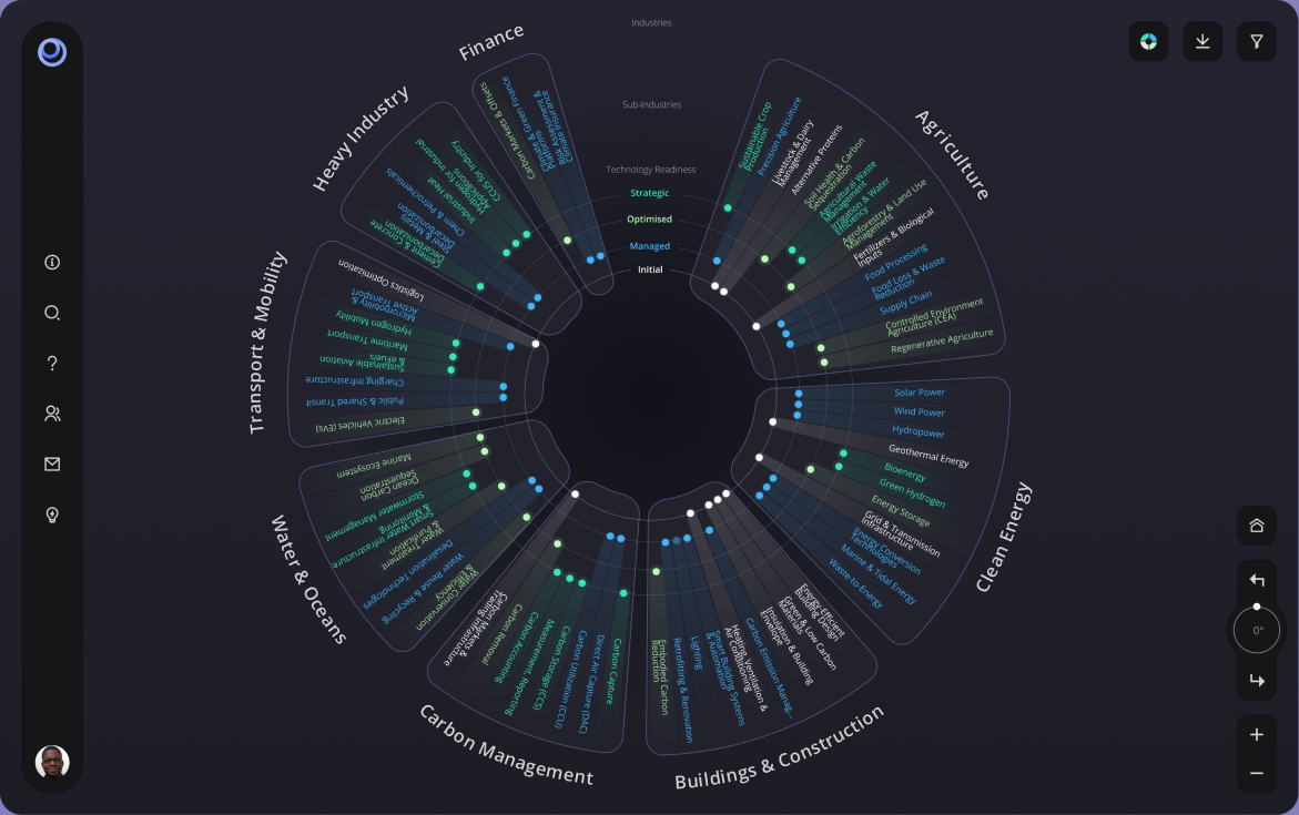
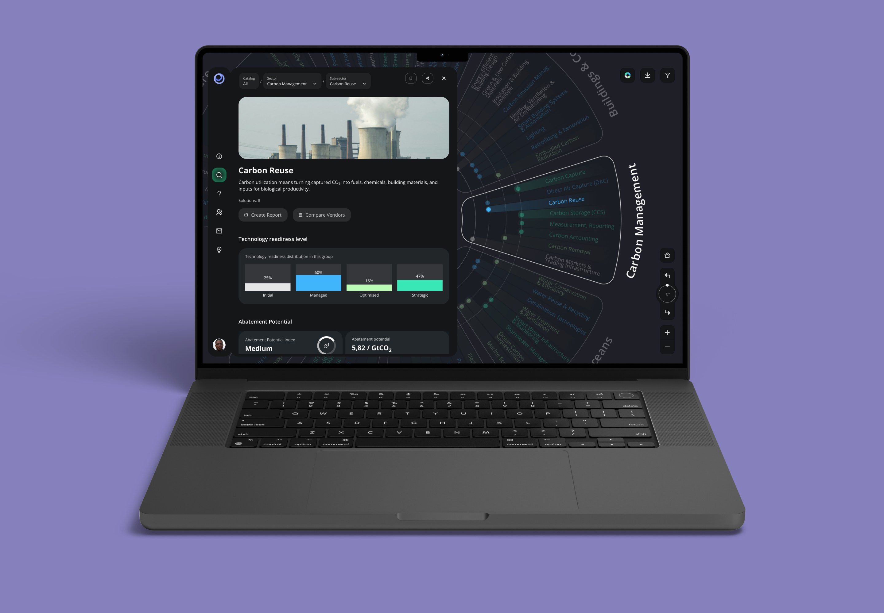
We tested multiple data visualization options and, through usability testing, identified the one that enabled users to find results most efficiently—a circular taxonomy diagram. We also developed all additional functionalities, including a technologies comparison tool, a statistics module, and a separate admin site for portal management.
/ Feature 2
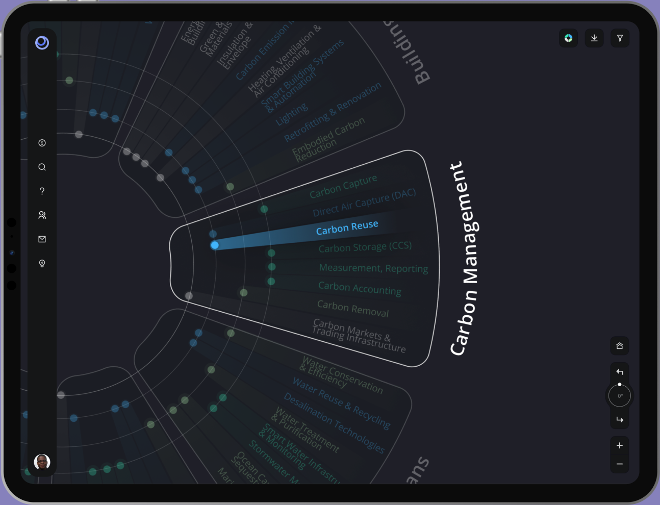
Zoomable Graph
The key interaction happens through working with the visualization. The chart is interactive and shows additional details about the taxonomy of technology solutions at different zoom levels.
/ Feature 3
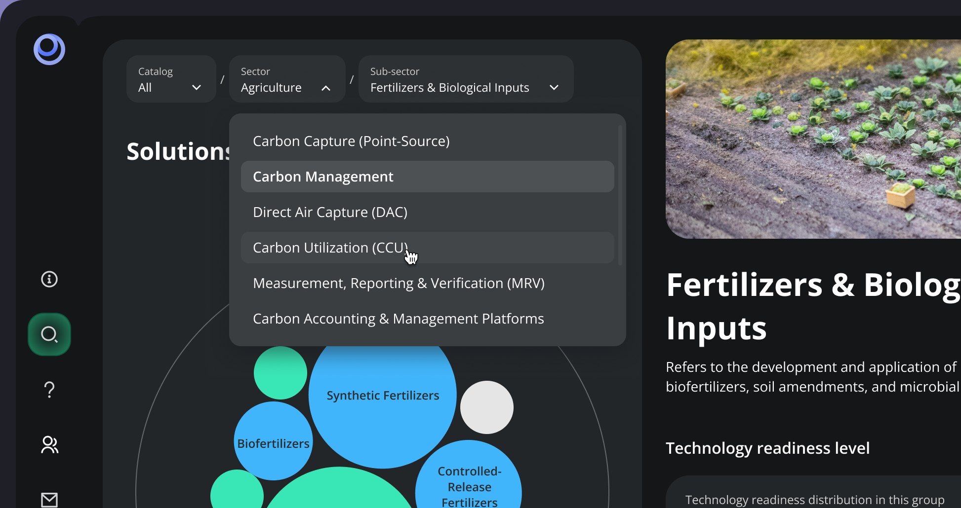
Advanced Breadcrumbs
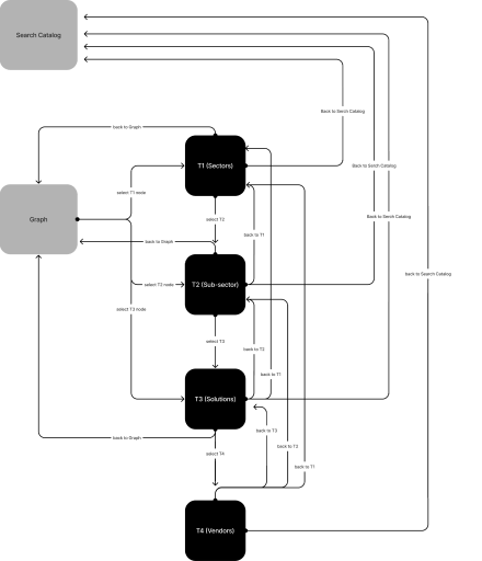
The second navigation method for moving through the levels is breadcrumbs. They allow users to instantly change their location directly from the page, see the full level structure, and navigate to any level without need to go back.
/ Feature 4
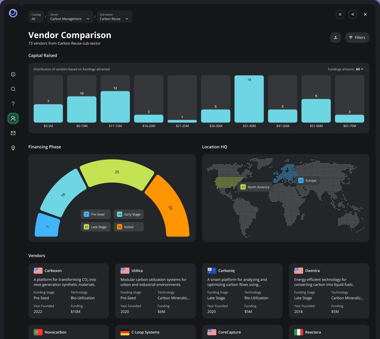
Vendor comparison
This view helps compare vendors and their market capitalization within a specific taxonomy level. The dashboard also helps users understand where they are based and learn more about their solutions and services.
Results
The client received a scalable product that can be easily updated with new content via the admin system. Information retrieval and presentation preparation time was significantly reduced thanks to the automation of internal workflows. The MVP was successfully showcased at an emissions reduction exhibition. My team handled four releases and continued to provide consultative support for the development of related tools.
1.
Improved workflow efficiency by 32%
Lay the groundwork for future sustainability-focused products and establish a unified visual language.
2.
Accelerated intern training by 20%
Significantly reduced the time spent on conducting searches and preparing final client proposals.
3.
Automated presentation flow
One of the key features of the product is the ability to quickly compare different technologies and automatically generate client proposals.
4.
Set design standards for related products
Our design system has become the standard for developing new digital eco-related products for the company.